




















Colour is the number one reason a print disappoints, and almost every disappointment is avoidable. This guide collects everything you need to get the colour you expect on a signboard, banner, sticker or poster: how print colour works, how to set up your file, which black to use, how to check your file, and when to pay for colour matching. Each section links to a deeper article if you want the detail.
1. CMYK vs RGB: what's the difference?
RGB (red, green, blue) is colour made of light — what phones, monitors and TVs use. CMYK (cyan, magenta, yellow, key/black) is colour made of ink — what every printer uses, including the large-format UV and eco-solvent machines we run for signage. Light adds up to white; ink subtracts down to black. Because ink can only reflect light rather than emit it, CMYK has a smaller range of colours than RGB, and the bright, glowing colours you see on screen are the ones that print more muted.
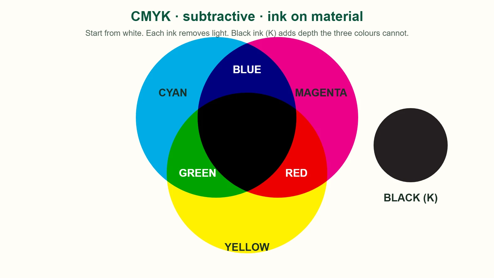
Rule of thumb: screens → RGB, anything printed → CMYK. Full explanation: RGB vs CMYK for printing.
2. How to convert RGB to CMYK

You cannot convert RGB to CMYK "perfectly", because some RGB colours have no CMYK equivalent. What you can do is convert early, see what shifts, and fix it:
- Illustrator: File → Document Color Mode → CMYK, then Edit → Edit Colors → Convert to CMYK.
- Photoshop: turn on View → Proof Colors first, then Image → Mode → CMYK Color.
- Canva Pro: Download → PDF Print → colour profile CMYK. (Free Canva is RGB only.)
- One colour only? Use our free RGB to CMYK converter — it gives the values and an approximate print preview.
After converting, re-pick any colour that turned dull from a printed chart rather than nudging sliders on screen. We accept RGB files and convert them ourselves, but the conversion cannot create colours the ink cannot make.
3. Choose print-safe colours from a chart
The fastest way to choose colours that print well is to look at ink, not pixels. Our free CMYK colour chart is a two-page A4 PDF of print-safe values by colour family — reds, oranges, greens, blues, purples, pinks, teals, greys — each chip labelled with its C·M·Y·K. Print it on the material you plan to order, choose from the sheet, and type the values into your file.
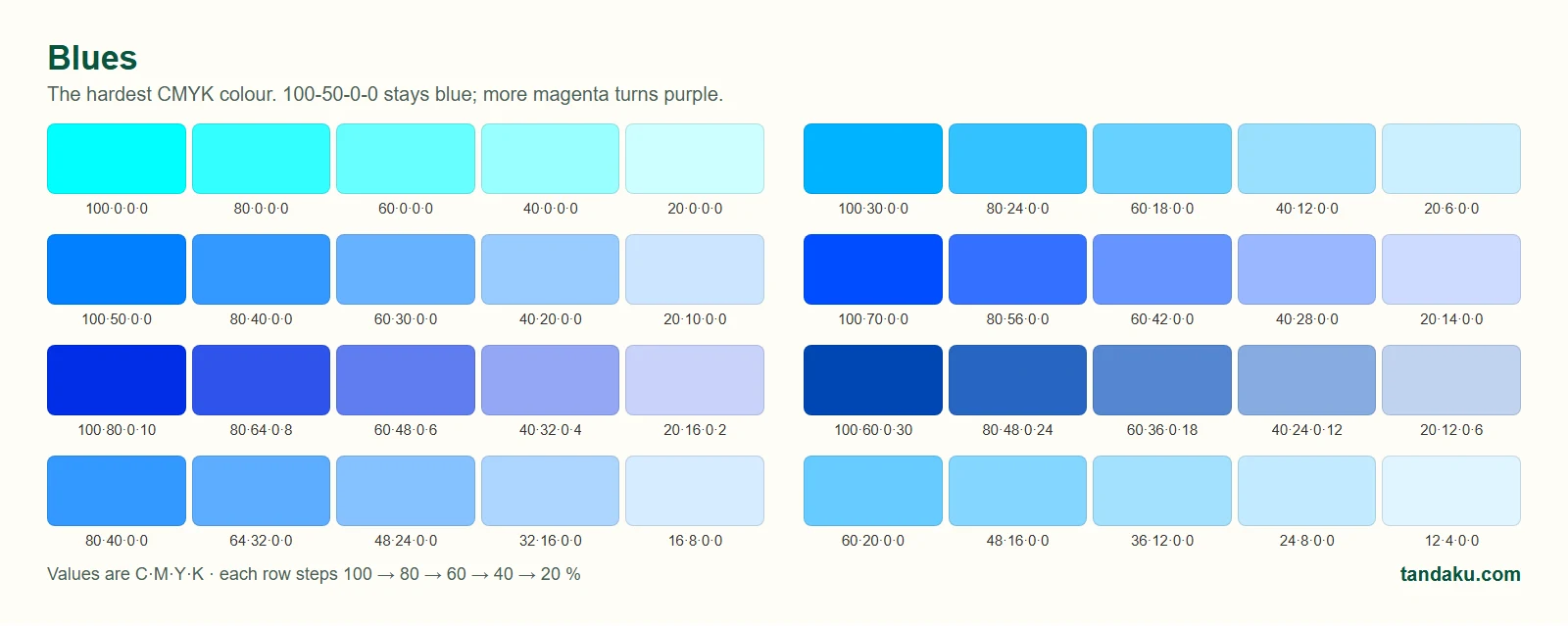
Three values worth memorising:
| Want | Use | Avoid |
|---|---|---|
| A true blue | 100·50·0·0 to 100·70·0·0 | 100·100·0·0 (prints purple) |
| A bright orange | 0·50·100·0 | Anything with cyan in it |
| A clean red | 0·100·100·0 | Extra magenta (goes pink) |
4. Standard black vs rich black
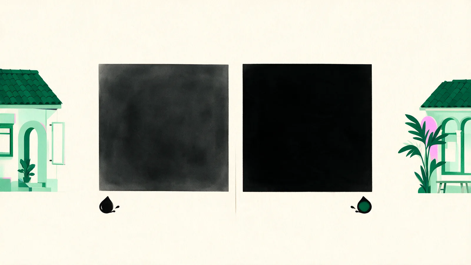
Black is the most-used colour on a sign, and there are two kinds:
- Standard black — 0·0·0·100. Black ink only. Use it for text, thin lines and small details. It stays sharp because only one ink has to land in the right place.
- Rich black — 60·40·40·100. Black with cyan, magenta and yellow underneath. Use it for large solid areas — a black signboard background, a black banner panel — where plain K alone looks dark grey. Do not push all four inks to 100 %; it over-saturates the material.
In one file you will often use both: rich black for the panel, standard black for the lettering on top.
5. Why colour varies, and how much is normal
Even a perfect CMYK file will not print identically every time. Material (gloss vinyl vs matte board vs canvas), lamination, the machine's ink, the batch, and the light you view it under all move colour slightly. Screen-to-print and across-material differences are visible; batch-to-batch differences are only noticeable side by side. A clearly wrong colour is an error, and we reprint errors. Details and a tolerance table: colour variance in printing.

6. Colour matching: when "close" isn't enough
For most signs, print-safe values and a CMYK file are all you need. When the colour has to be right — a brand colour, a franchise standard, matching last year's sign — use the colour-critical service:
- Tick Colour-critical job at the artwork upload step in the configurator. It adds RM50 per item.
- Upload a photo of your physical sample — a previous print, a Pantone swatch, packaging, a business card. Daylight, no flash.
- Type any colour codes you know (Pantone / CMYK / HEX) in the instructions box.
- Our technician colour-matches on the actual material, prints a test strip, and contacts you on WhatsApp or phone. Nothing prints until you have agreed the colour.
For brand colours you reorder regularly, tell us — we record the machine, profile and material so the next batch matches.
7. Check your file before you pay
When you upload artwork in our configurator, the preflight reads the file and tells you, before checkout:
- whether it is RGB, CMYK or mixed (RGB files get a note that bright tones will print more muted)
- the resolution at your ordered size
- whether it has bleed and whether the size matches your order
A designer then reviews every file before printing. You can also view a PDF proof in Adobe Reader — set View → Proof Colors if you have Acrobat Pro — remembering that your screen is still RGB, so the proof shows layout and content exactly and colour approximately.
8. Quick checklist
- Document colour mode: CMYK
- Brand colours picked from a printed chart, values typed in, not auto-converted
- Blue is 100·50·0·0-ish, not 100·100·0·0
- Text in 100 K; big black panels in rich black
- Same material and finish for pieces that must match
- Colour-critical ticked and a sample photo uploaded if the colour must be exact
- File prepared with bleed and enough resolution — see preparing artwork for large-format printing
FAQ
What colour mode should I use for printing?
CMYK. Set the document colour mode to CMYK before you start designing, or convert before exporting. Printing uses cyan, magenta, yellow and black ink, so a CMYK file previews on screen roughly what the ink can reproduce.
How do I make sure my brand colour prints correctly?
Get the CMYK or Pantone value from your brand guidelines, check it against a printed CMYK chart on the material you are ordering, and put the value in your file. If it must be exact, choose the colour-critical option when ordering and our technician will match it to your sample and confirm with you before printing.
What is the difference between rich black and standard black?
Standard black is 0·0·0·100, black ink only, used for text and thin lines. Rich black adds the other inks under the black, for example 60·40·40·100, so large solid areas print deep black rather than dark grey.
Can you print Pantone colours?
We print CMYK, so Pantone spot colours are simulated with their closest CMYK mix rather than printed as a spot ink. Most Pantone colours simulate well; very bright or fluorescent ones do not. Choose colour-critical for a confirmed match.
Do you provide a proof before printing?
Every uploaded file is preflighted automatically and reviewed by a designer, and our team will contact you if anything needs fixing. For colour-critical orders the technician prints a test strip on the actual material and confirms with you before the full run.
How much does colour matching cost?
RM50 per item, flat. It covers matching to your physical sample on the actual material, a test strip, and a technician call to confirm before printing.