



















Some colour difference between your screen and your print is normal, and a small difference between two print batches is normal too. The screen makes colour with light; the print reflects it from ink on vinyl, board or fabric. Add material, finish, machine, lighting and even the age of the sign, and the same file can look slightly different every time. This guide explains each cause, how much variance to expect, and what to do when colour genuinely matters.
Screen vs print: the big one
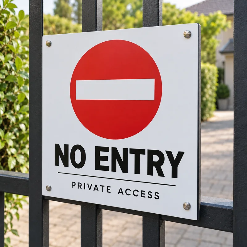
Your phone or monitor is backlit and shows RGB light. A signboard is CMYK ink that can only reflect the light in the room. Ink cannot glow, and it cannot reach every colour a screen can, so saturated colours — bright green, electric blue, orange, magenta — print more muted. This is not a fault; it is physics, and it is the same at every print shop in Malaysia. The full explanation is in RGB vs CMYK for printing.
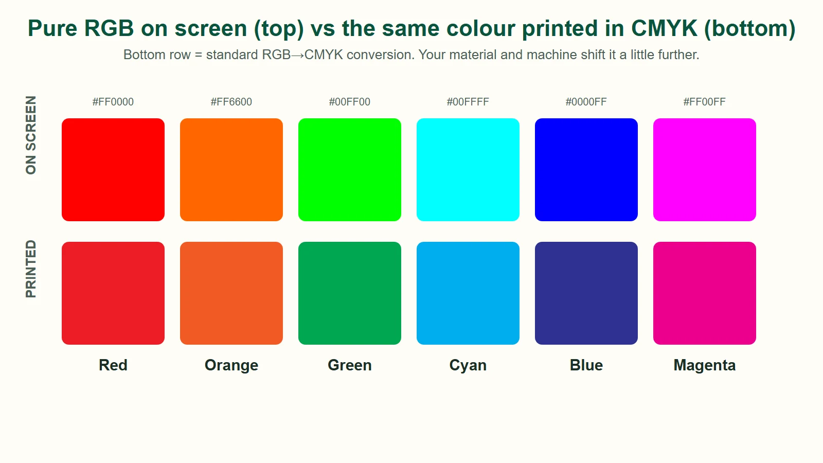
Two things make it worse:
- Uncalibrated screens. Most phones are set to "vivid" and most laptops are too bright and too cool. Two people looking at the same file on two devices already see two different colours.
- RGB files. An RGB design gets converted to CMYK at the printer. Out-of-gamut colours are replaced with the nearest printable ones. Designing in CMYK, or picking colours from a printed CMYK chart, removes most of the surprise.
Material: the same ink looks different on different surfaces
Each material absorbs and reflects ink differently. The same CMYK values printed on our common materials:
| Material | How colour tends to look |
|---|---|
| Gloss vinyl / gloss lamination | Most saturated and contrasty; blacks look deepest |
| Matte vinyl / matte lamination | Softer, slightly lighter; reduces glare, can add a faint grey veil |
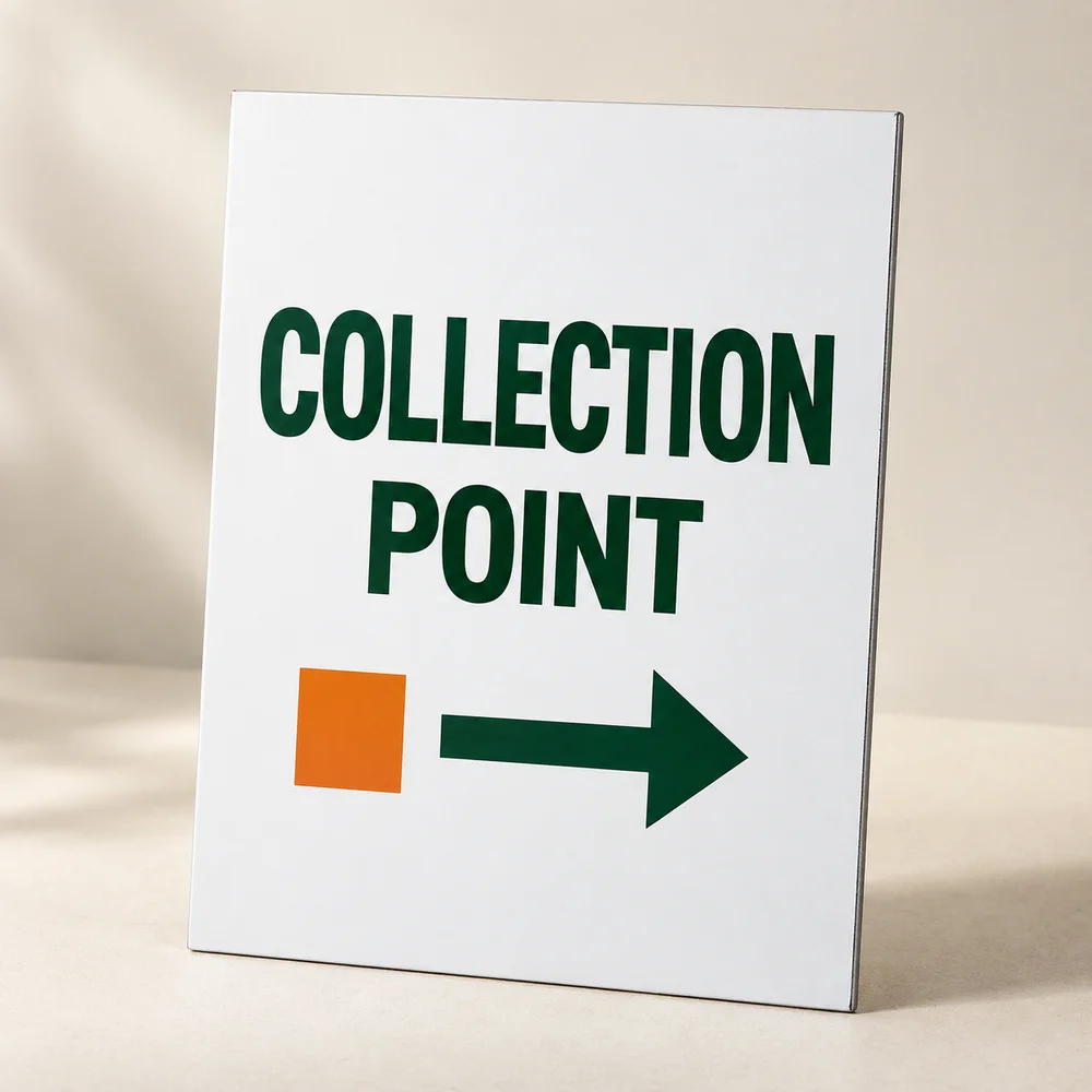
| PVC foamboard, KT board | Close to matte vinyl; bright whites keep colours clean |
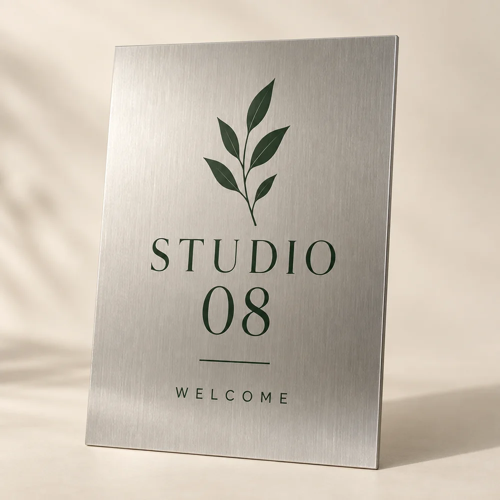
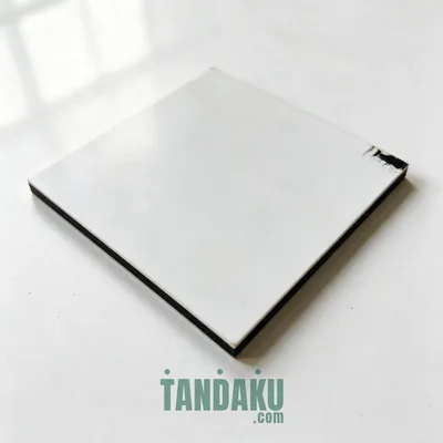
| ACP (aluminium composite) | Slight satin sheen, very consistent, good for brand colours |
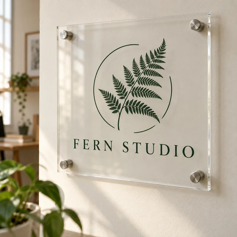
| Acrylic (printed on the back) | Glossy and deep because you view through the acrylic; white ink layer matters |
| Canvas, fabric, flex banner | Textured and more absorbent; colours flatten a little, fine detail softens |
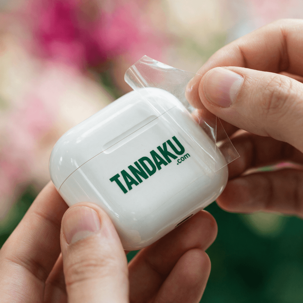
| Clear or frosted sticker | No white backing unless printed, so colours look lighter and see-through |
If you order the same design on two materials, say a shopfront ACP sign and a matching matte vinyl sticker, expect them to be close rather than identical.
Finish and lamination

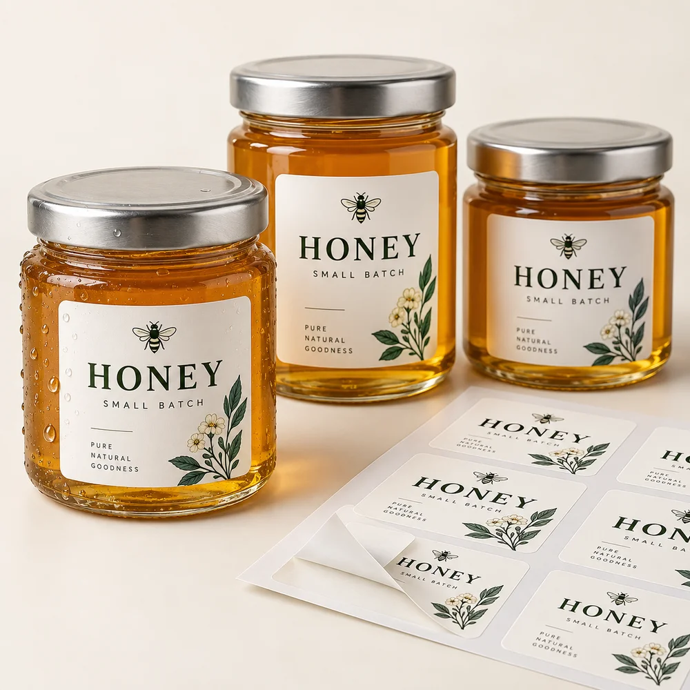
Lamination changes colour after printing. Gloss lamination boosts saturation and depth. Matte lamination cuts reflection and desaturates slightly — it can also warm or cool the tone a touch depending on the film. Anti-slip floor lamination is textured and softens colour more than either. If you approved a colour on an unlaminated proof, tell us whether the final piece will be laminated.
Machine and ink: UV vs eco-solvent
We print on both UV roll-to-roll / flatbed machines and eco-solvent machines. Both use CMYK, but the inks are chemically different: UV ink cures instantly as a layer on top of the material and gives punchier, slightly more matte colour; eco-solvent ink soaks into the vinyl for a smoother, more photographic look. The same file printed on the two machines will differ a little, which is why we keep a job on one machine when consistency matters.
Batch-to-batch variance
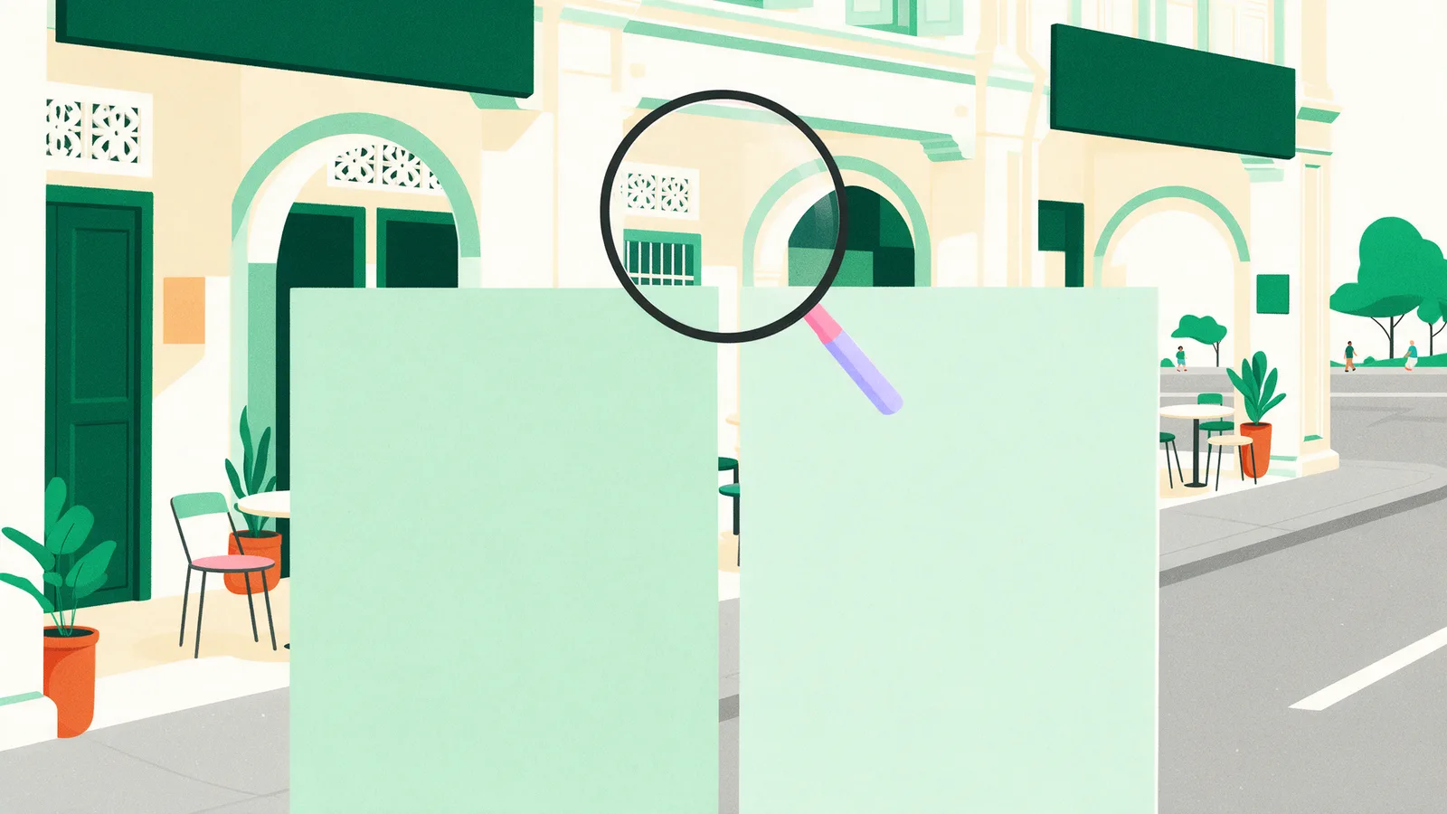
Every print run drifts a little: ink density, head temperature, humidity in the workshop and the age of the ink all move colour by a small amount. A reprint six months later will be close but may not be a perfect match, and a very long run can shift slightly between the first and last metre. Reputable shops keep this within a tolerance you would only notice with the two prints side by side. If you know you will reorder — a set of estate signs, a chain of outlets — tell us so we can record the machine, profile and material used.
Lighting and viewing
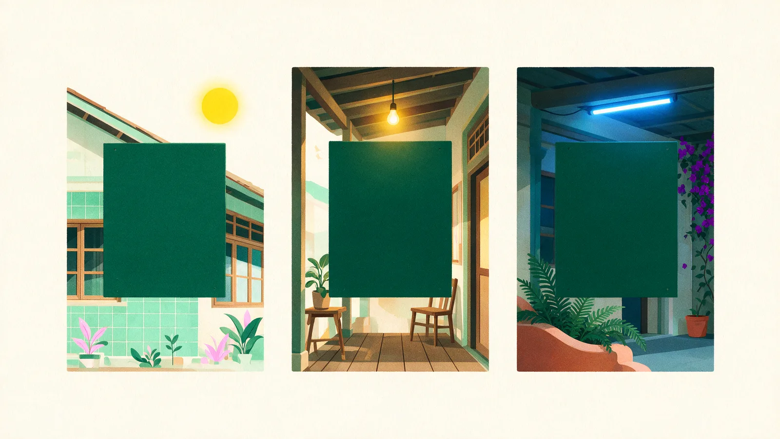
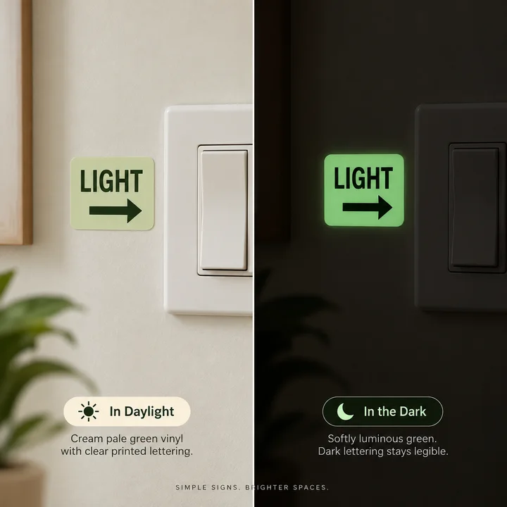
The same sign looks different under the yellow light of a hawker centre, the cool white of an office, and the afternoon sun outside. Judge colour in daylight, with the sign at its final viewing distance. Fine banding, slight grain and small colour steps that are visible at 30 cm disappear at 3 m, which is the distance a signboard is designed for.
Sunlight and time

Outdoor colour also changes over the life of the sign. UV light fades pigments — reds and magentas first, then yellows — so an unlaminated eco-solvent print starts to soften after a year or two of direct Malaysian sun, while UV-cured ink and laminated prints last longer. If the sign is going outdoors, ask for lamination or a UV-printed material and expect to refresh it every few years.
How much variance is normal?
- Same file, same batch, same material: differences you cannot see unless you hold two pieces edge to edge.
- Same file, reprinted later: a small shift that is only noticeable side by side.
- Screen to print: saturated colours visibly more muted; everything else close.
- Across materials or finishes: a noticeable but "same family" difference.
If a print is a clearly different colour — blue where you specified green, a purple that should be navy — that is an error, not variance, and we will reprint it.
When colour genuinely matters
- Design in CMYK and re-pick brand colours from a printed chart rather than auto-converting.
- Give us the numbers — CMYK values or a Pantone code in the order notes beat "match my logo on my phone".
- Use one material and one finish for pieces that must match each other.
- Tick colour-critical when you upload (RM50 per item). You upload a photo of your physical sample — a previous print, a Pantone swatch, packaging — our technician colour-matches on the actual material, contacts you on WhatsApp or phone, and prints only after you have agreed the colour.
For everything else, the free RGB to CMYK converter will show you roughly how a colour shifts before you order, and the signboard configurator flags RGB files at upload so you are never caught out.
FAQ
Why does my printed signboard look different from the design on my screen?
Screens show RGB light and can display colours that CMYK ink cannot reproduce, so bright and neon colours print more muted. Your device's brightness and "vivid" settings widen the gap further. Designing in CMYK and choosing colours from a printed chart keeps the difference small.
Is it normal for two prints of the same file to look slightly different?
Yes. Ink density, humidity, machine and material all drift a little between batches. A well-run shop keeps this within a tolerance you only notice with the two prints side by side. Tell us if a job will be reordered so we can record the exact setup.
Does matte or gloss change the colour?
Yes. Gloss finishes and gloss lamination make colours look more saturated and blacks deeper. Matte finishes soften colour and reduce glare. Choose the finish before approving colour, and keep it the same across pieces that must match.
Will my outdoor sign fade?
Over time, yes. Direct sun fades reds and magentas first. UV-cured ink and lamination slow this considerably; unlaminated eco-solvent prints fade fastest. For a shopfront, choose UV-printed ACP or laminated vinyl and expect to refresh the sign every few years.
Can you guarantee an exact colour match?
Standard orders are printed to our CMYK profiles with normal screen-to-print variance. For a guaranteed match choose the colour-critical option (RM50 per item): our technician matches to your physical sample on the actual material and confirms with you before printing.
What if the colour is completely wrong?
A clearly different colour — not a shade off, but the wrong hue — is an error, not variance. Send us a daylight photo of the print next to your reference within 7 days and we will reprint it.