






















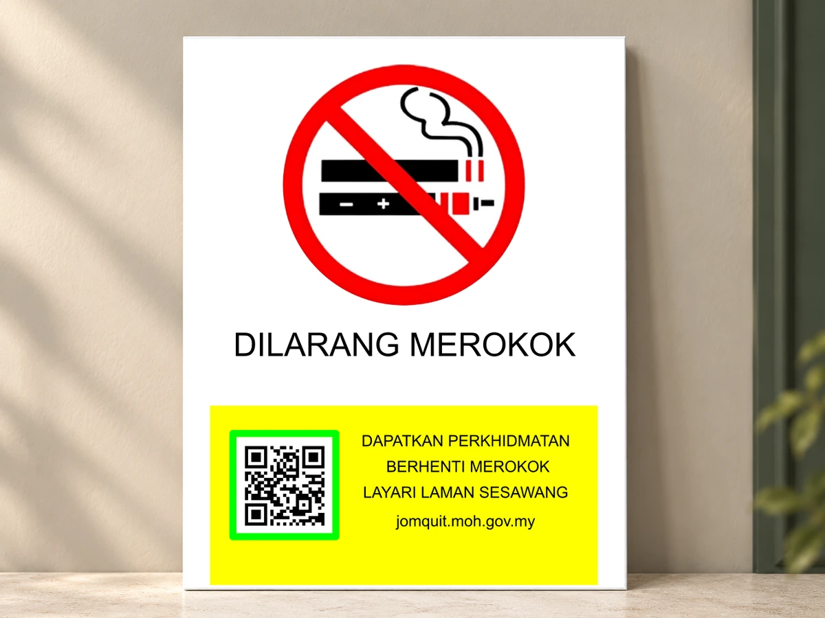



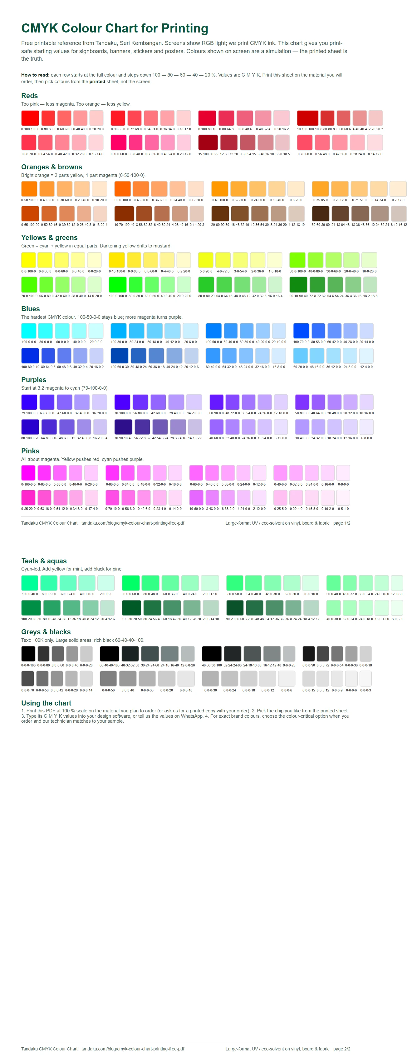
Need CMYK values that actually print well? Download our free CMYK colour chart (2-page A4 PDF), print it on the material you plan to order, and pick colours from the printed sheet instead of guessing from a screen. Every chip is labelled with its C·M·Y·K value so you can type it straight into Illustrator, Photoshop, Canva or CorelDRAW.
Download the Tandaku CMYK colour chart (PDF, free) — no email, no sign-up.
Why a printed chart beats any screen
Your monitor and phone show colour as RGB light. A signboard, banner or sticker is CMYK ink sitting on vinyl, board or fabric, reflecting whatever light is in the room. Ink simply cannot reach every colour a backlit screen can, so bright greens, electric blues, neon oranges and hot pinks always print more muted than they look on screen. The full explanation is in RGB vs CMYK for printing.
A colour chart fixes the problem from the other direction. Instead of designing on screen and hoping, you look at real ink on real material, choose the chip you want, and use its values. The chart on this page is built for the way we print — large-format UV and eco-solvent on vinyl, PVC board, ACP, foamboard, canvas and fabric — rather than for offset on paper.
How to read the chart
- Each row starts with a base colour at full strength on the left, then steps down 100 → 80 → 60 → 40 → 20 % as you move right.
- The number under every chip is C·M·Y·K, for example
100·50·0·0means 100 % cyan, 50 % magenta, no yellow, no black. - Rows lower in each group are secondary mixes — the same family pushed warmer, cooler, darker or greyer.
- Screens show a simulation of each chip. The printed sheet is the truth.
Tip: print the PDF at 100 % scale (no "fit to page"), on the same material and finish you intend to order. Gloss vinyl and matte vinyl will not look identical, and neither will look exactly like plain office paper — that is the whole point.
Reds
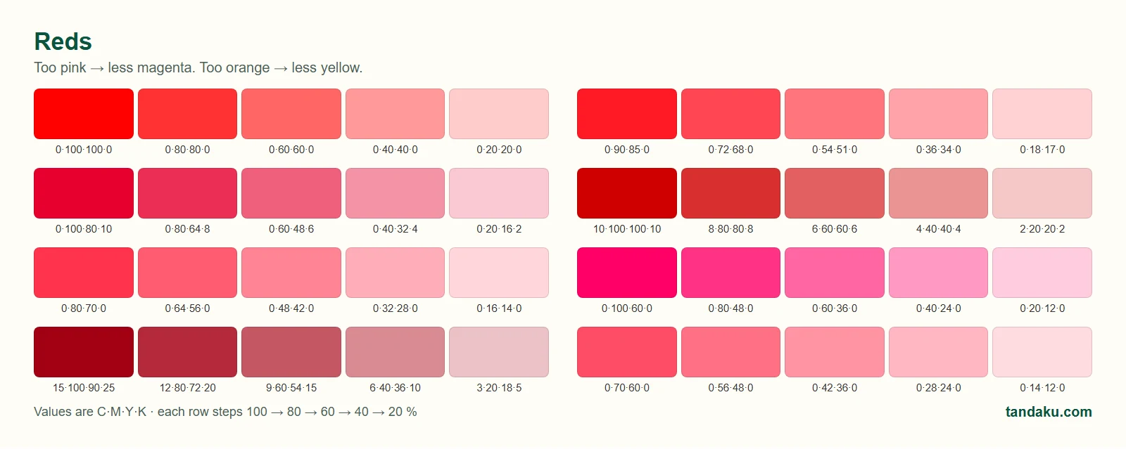
Red is the colour customers complain about most. Too pink means too much magenta; too orange means too much yellow. 0·100·100·0 is a clean, safe print red. For a deeper brand red add a touch of black rather than more magenta.
Oranges and browns
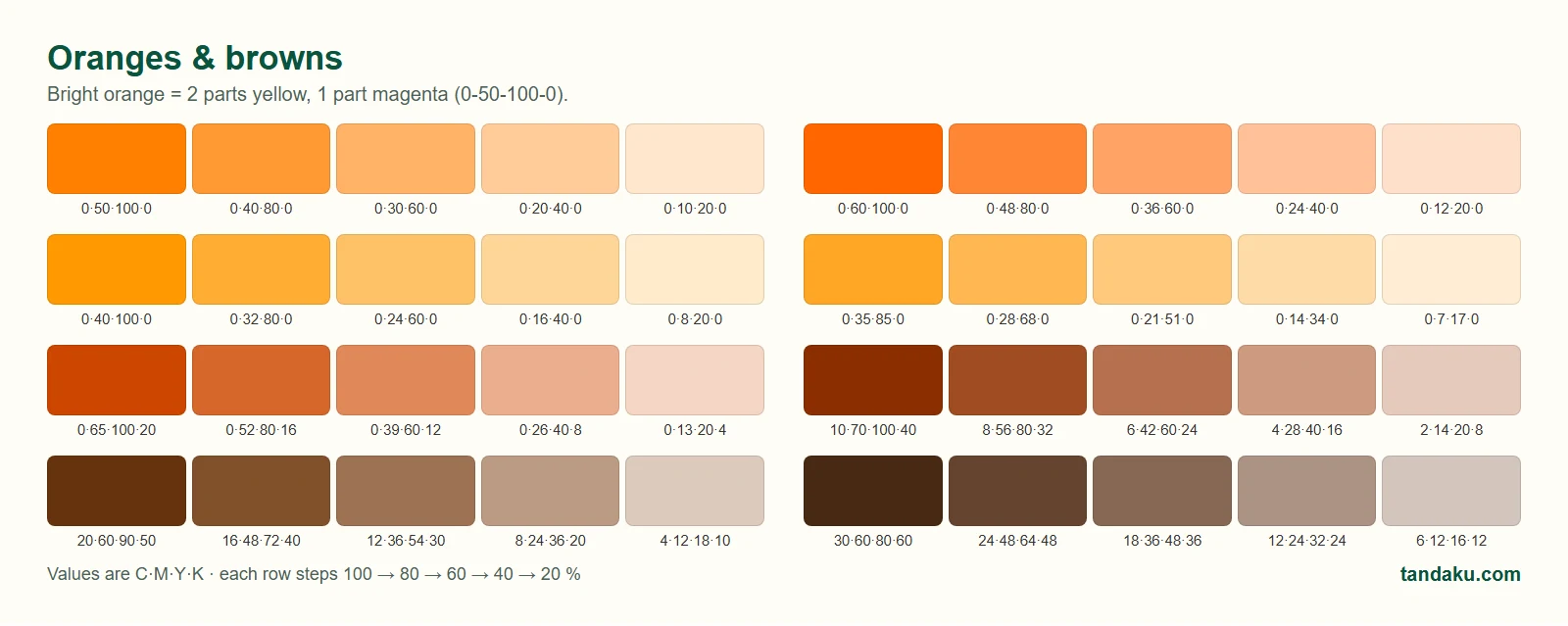
Bright orange is easy: two parts yellow to one part magenta, 0·50·100·0. Push the magenta up for a rust orange, add black for earthy browns. Oranges print reliably and read well from a distance, which is why so many safety and promo signs use them.
Yellows and greens
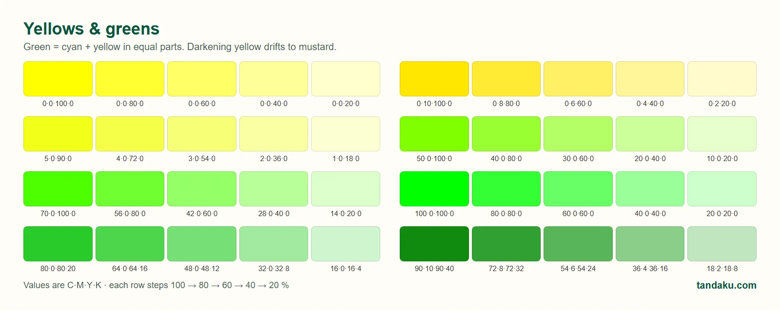
Cyan plus yellow makes green — equal, dense amounts give the most vivid result (100·0·100·0). Be careful darkening yellow: a little black turns it mustard, a little cyan turns it sage. Neon lime from a screen (#00FF00) is out of gamut and will print as a leaf green no matter what you do.
Blues
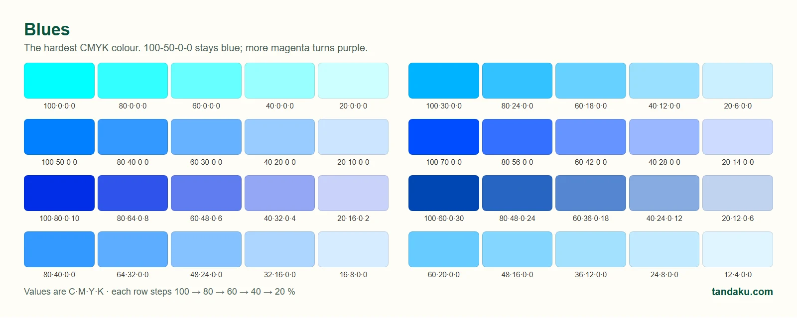
Blue is the hardest colour to hold in CMYK. The classic mistake is converting screen blue #0000FF, which becomes 100·100·0·0 and prints purple. Keep the mix balanced — 100·50·0·0 to 100·70·0·0 stays blue. Add black, not magenta, if you want it darker.
Purples
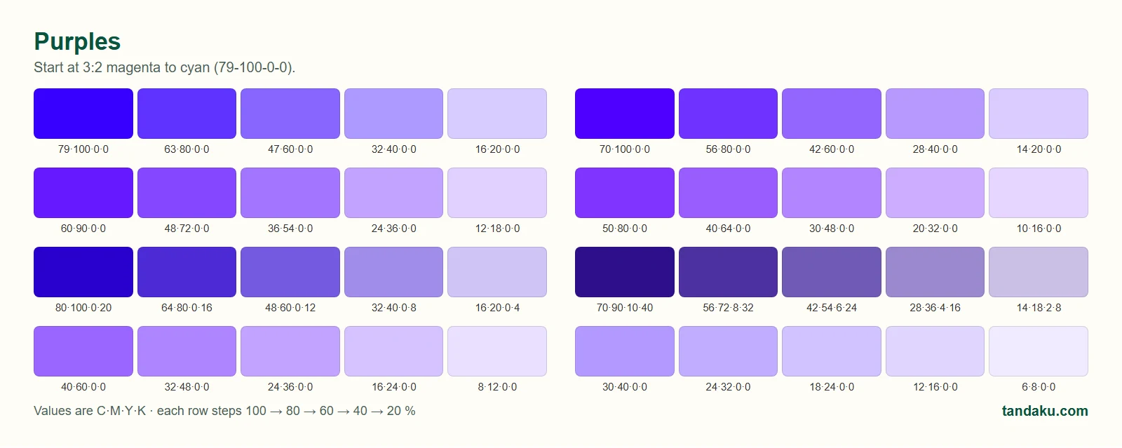
Purples are CMYK-friendly. A 3:2 magenta-to-cyan ratio is the place to start (79·100·0·0). More cyan moves toward violet, more magenta toward plum.
Pinks
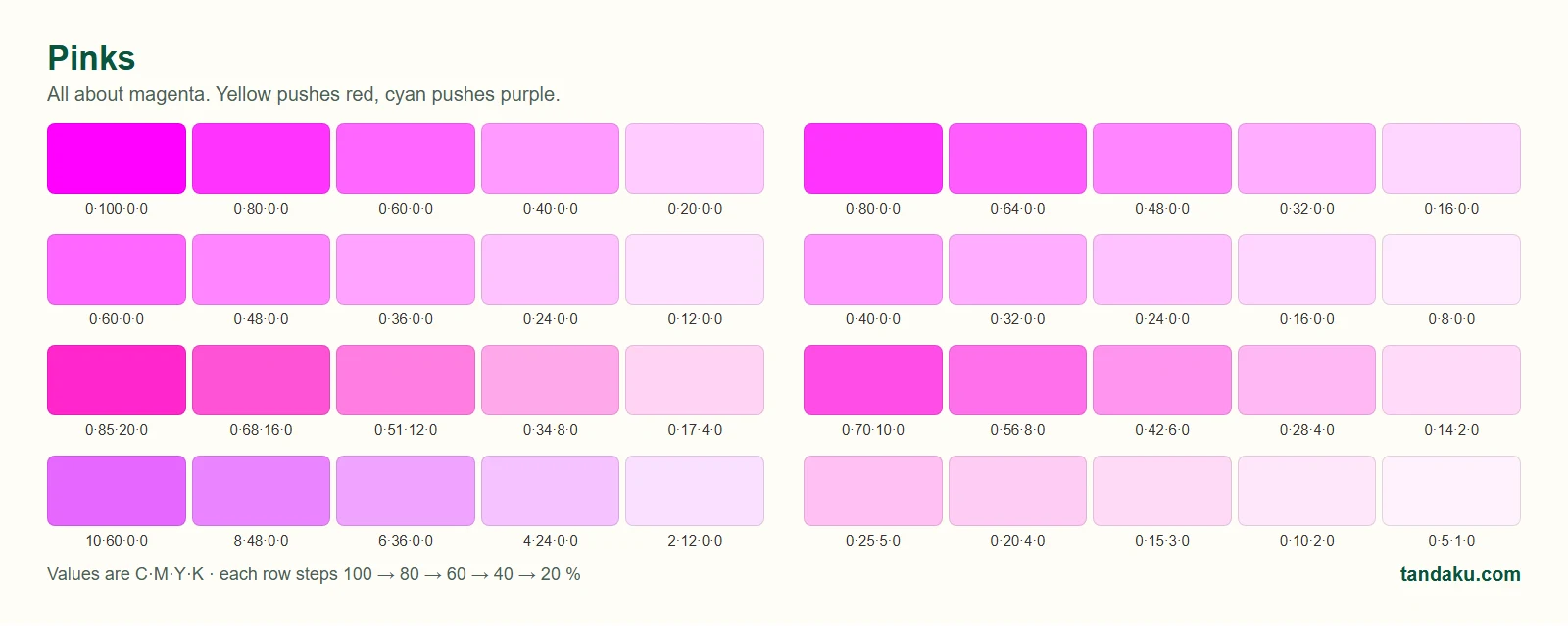
Pink is all about magenta. Keep cyan and black low; a little yellow warms it toward coral, a little cyan cools it toward lilac. Hot pink prints well — brighter than most people expect — but "neon" fluorescent pink is a special ink we do not stock.
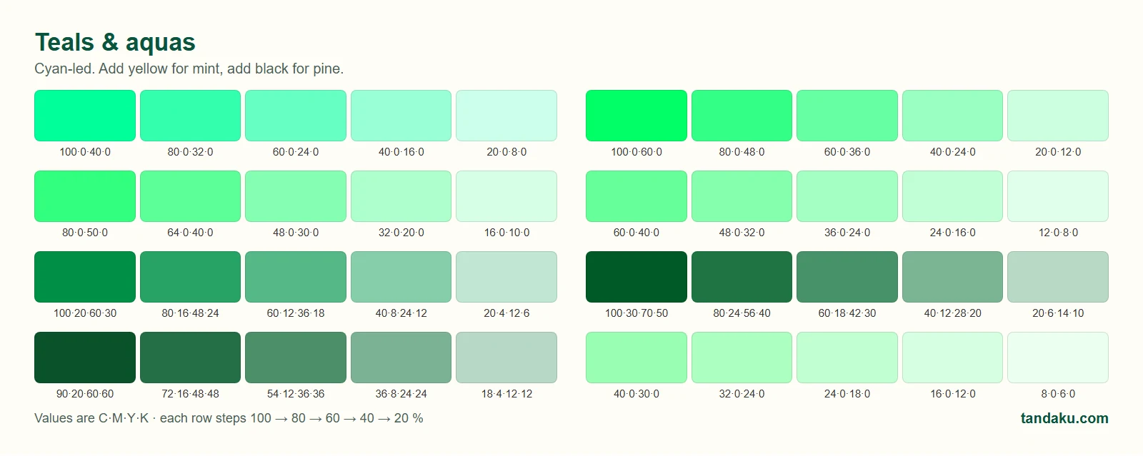
Teals and aquas
Cyan-led mixes. Add yellow for mint and aqua, add black for pine and forest tones (our own brand green is close to 100·30·70·50). Teals are among the most consistent colours across materials.
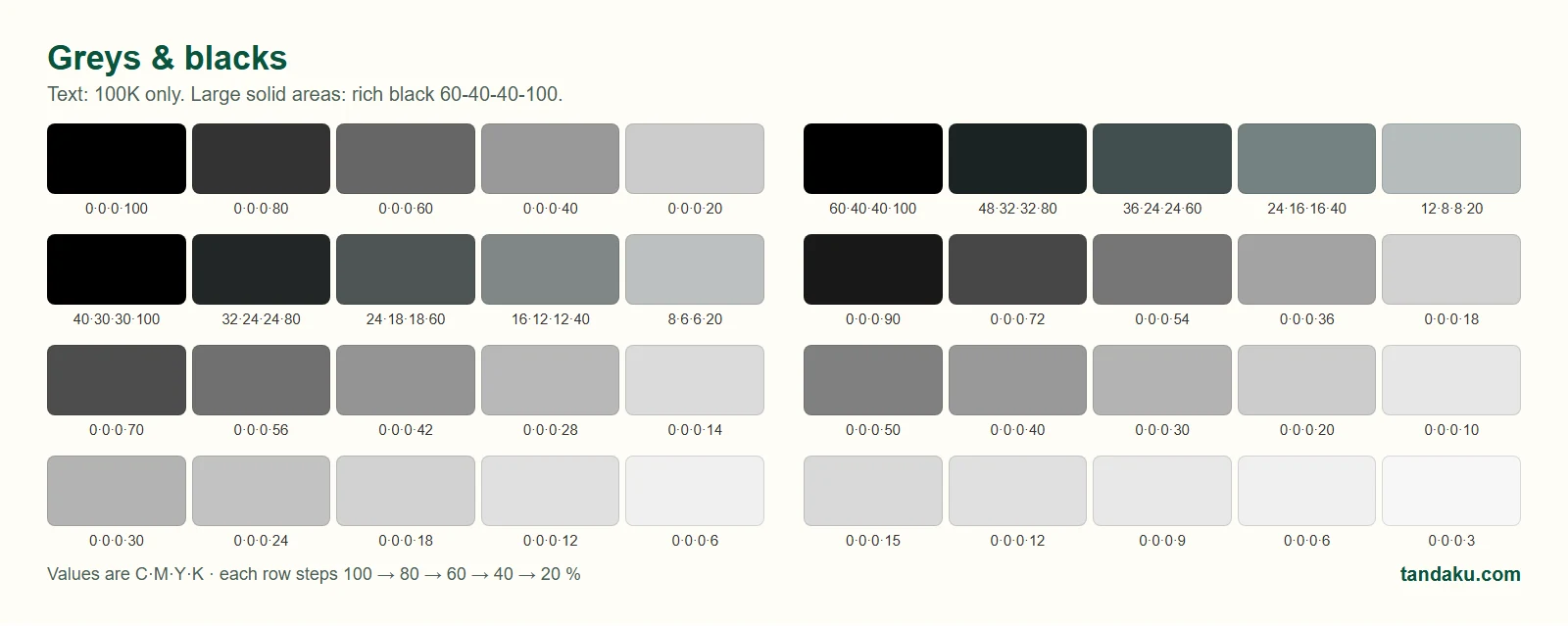
Greys, black and rich black
- Text and thin lines: plain black,
0·0·0·100. It stays crisp and cannot mis-register. - Large solid black areas (a black signboard background, a black banner): use a rich black such as
60·40·40·100. Plain 100 K on its own looks dark grey on a big panel. - Do not set everything to 100 —
100·100·100·100floods the material and can bleed or crack on lamination. - Greys: use black only (
0·0·0·50) for neutral greys. Mixing CMY to make grey tends to drift warm or cool between batches.
Metallic gold and silver
CMYK cannot print a real metallic. What you get is a flat gold (0·20·60·20 to 10·30·80·30) or a flat silver (0·0·0·30 to 10·5·5·40) — fine for a logo on a banner, not the same as foil. For a true metallic look choose a brushed gold or silver acrylic / ACP as the base material and print the rest of the artwork on top, or ask us about gold vinyl.
Using the chart with your order
- Print the PDF on the material you plan to order — or WhatsApp us and we will send a printed copy with your job.
- Pick chips from the printed sheet and note their C·M·Y·K values.
- Set those values in your design file (and set the document colour mode to CMYK — see how to prepare artwork).
- Upload the file in the signboard configurator. Our preflight tells you whether the file is RGB or CMYK before you pay.
- If the colour must be exact — a brand colour, or matching an earlier print — tick colour-critical at upload (RM50 per item). Our technician colour-matches to your physical sample and confirms with you before anything prints.
Want to check one specific colour first? Our free RGB to CMYK converter shows the values and an approximate print preview.
If you are picking colours for a poster run, the poster printing page shows current sizes and prices.
FAQ
Is the CMYK colour chart free to download?
Yes. The Tandaku CMYK colour chart is a free two-page A4 PDF with no sign-up. Download it, print it on the material you intend to order, and use the printed chips to choose your colours.
Why do the chart colours look different on my screen than on paper?
Screens display RGB light and can show colours that CMYK ink cannot reproduce. The on-screen version of the chart is a simulation; only the printed sheet shows what ink on that material really looks like. That is exactly why you should print it rather than choose from the screen.
What CMYK value is a good blue for signboards?
Use a balanced mix such as 100·50·0·0 or 100·70·0·0. Converting screen blue (#0000FF) gives 100·100·0·0, which prints purple. Add black rather than magenta if you want a darker navy.
What is rich black and when should I use it?
Rich black adds cyan, magenta and yellow under 100 % black, for example 60·40·40·100, so large solid areas print deep black instead of dark grey. Use plain 0·0·0·100 for text and fine lines, and rich black only for big solid panels.
Can you match a Pantone colour?
We print CMYK, so Pantone spot inks are simulated rather than printed directly. Give us the Pantone code and we will use its CMYK equivalent; for a guaranteed match choose the colour-critical option (RM50 per item) and our technician test-prints on your material and confirms with you first.
Will the same CMYK value print the same on vinyl and on ACP?
Close, but not identical. Gloss surfaces look slightly more saturated, matte surfaces slightly softer, and fabric absorbs more ink. Print the chart on each material you use if consistency across products matters — see why print colour varies.