
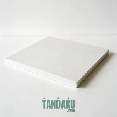
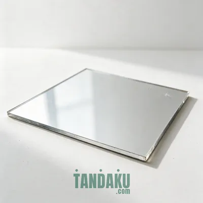
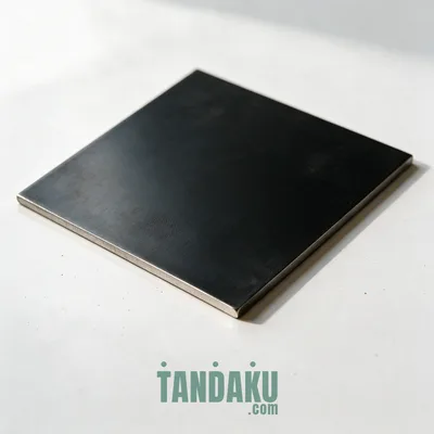
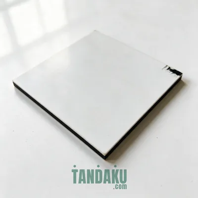






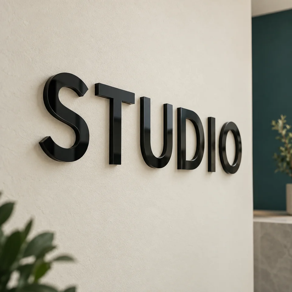
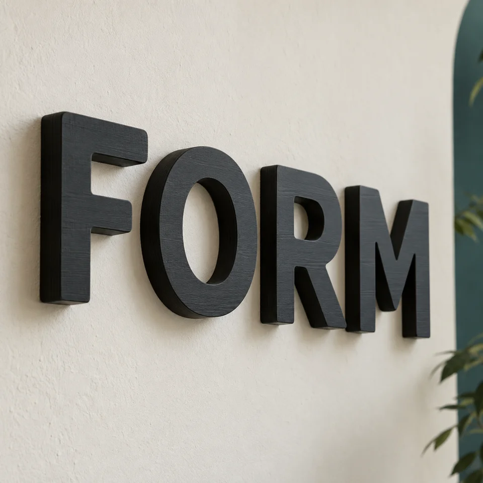

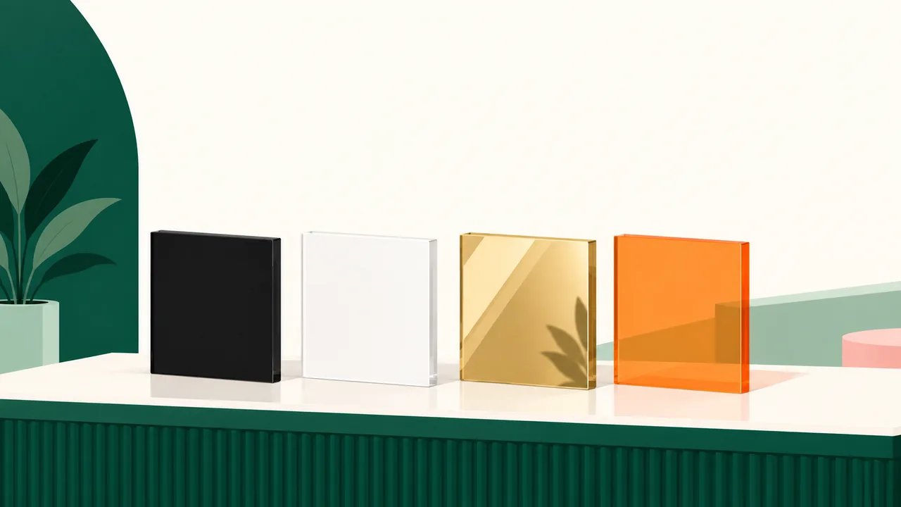
Choose matte acrylic letters where glare would make the name harder to read, gloss for a shiny face, and mirror acrylic for a reflective finish in an indoor or sheltered position. Match the colour to the actual wall and check the room lighting before deciding; tinted acrylic is translucent, so its appearance also depends on what sits behind it.
Which acrylic letter finish should you choose?
Start with the appearance you need in the finished room. A finish that looks attractive as a small sample can become distracting across a whole business name, especially when it reflects ceiling lights.
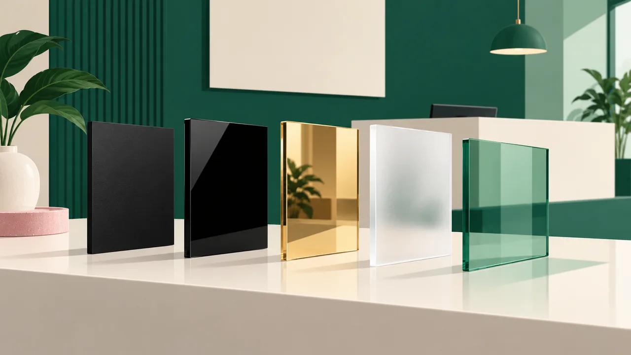
Tandaku offers matte, gloss, mirror, frosted and tinted acrylic letters. These finishes change how the face looks; they do not all produce the same effect under light.
| Finish | What it looks like | When to consider it | What to check |
|---|---|---|---|
| Matte black or white | A flat face with less glare | Reception walls and spaces with downlights | Contrast against the wall |
| Gloss black | A smooth, shiny face | Boutique or salon lettering where shine suits the room | Reflections from windows and ceiling lights |
| Gold, silver or rose gold mirror | A reflective metallic appearance | Indoor or sheltered feature walls | What the face will reflect |
| Tinted colour | A translucent coloured face | Designs where light passing through is part of the look | The background and available light |
| Frosted | A translucent, softened appearance | A softer visual effect than clear acrylic | Whether the outline remains distinct |
If you are still deciding between acrylic, metal and fabricated lettering, use the sign letter types and fonts guide before choosing the finish.
How should the letter colour work with your wall?
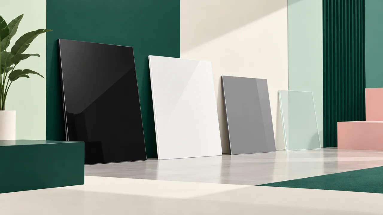
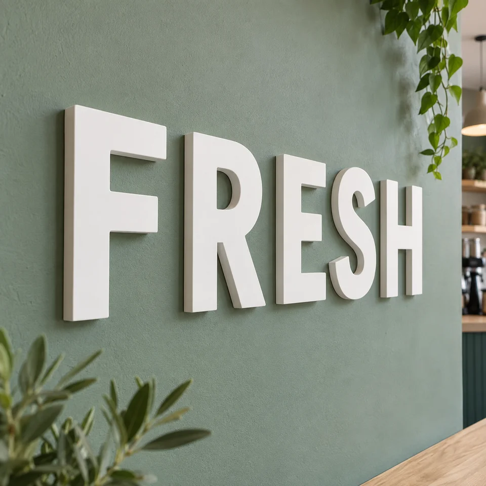
Choose the background before choosing the letters. White matte acrylic reads clearly against a dark wall, while black gives a stronger contrast against a pale wall. Grey can look quieter, but a grey letter on a similar wall may be difficult to pick out.
Use a photo of the actual wall when reviewing the design. Include nearby finishes such as timber panels, glass or patterned wallpaper, because they compete with the outline of the name. A clean design preview on a plain white background may hide that problem.
Tinted acrylic needs particular care. It lets light through, so the background contributes to its appearance. Tinted red, for example, can appear deeper against a dark wall and brighter with light behind it.
For a business name that needs to be read quickly, prioritise a distinct outline and clear contrast. Keep decorative effects for places where people can stop and look.
What happens under downlights, windows and reflected light?
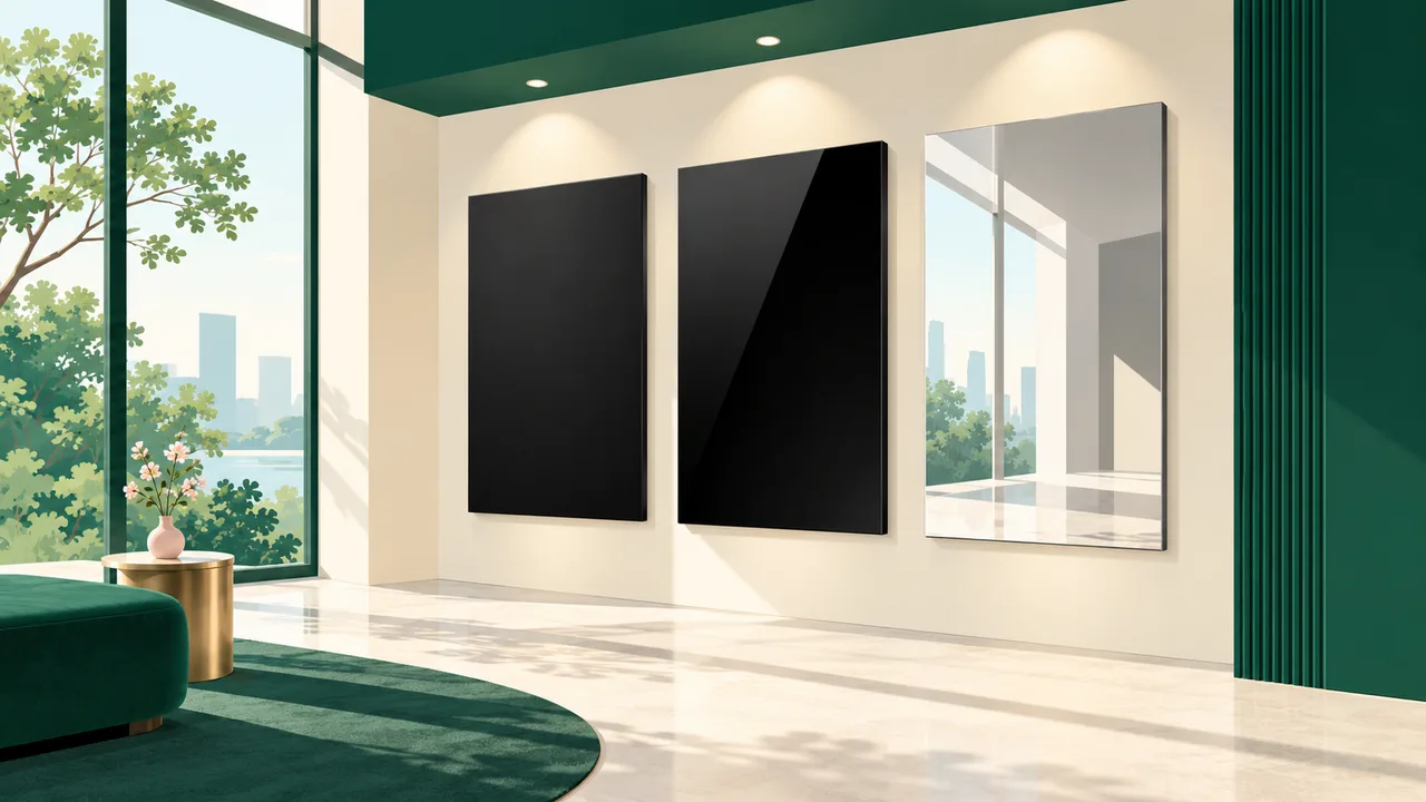
Look at the wall from the direction visitors approach it. A finish may look clear straight ahead but reflect a bright window when viewed from the doorway.
Black matte acrylic is a useful choice under downlights and shop spotlights because its face is non-reflective. Gloss black gives a shinier appearance, but reflected ceiling features can compete with the lettering.
Mirror acrylic reflects its surroundings. Consider what sits opposite the sign: a tidy reception area produces a different reflection from a busy shelf or bright entrance. Choose mirror because that reflected appearance suits the space.
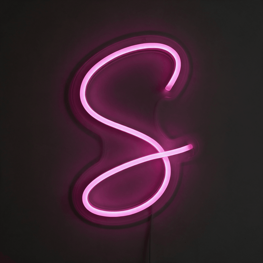
Translucent acrylic also needs a distinction between material and lighting. A tinted sheet passing light through it does not mean the finished letters include illumination. If you need a sign that lights up, compare the lighting arrangements in the guide to dimensional signboard types.
How thick should acrylic letters be?
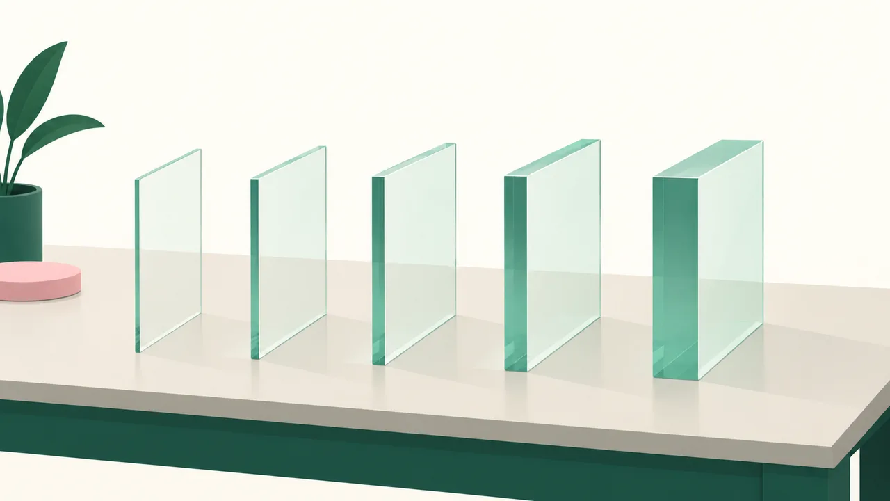
Acrylic letters are usually 3mm. Other thicknesses are available when you want a different edge or a more substantial appearance.
Decide on the face finish first, then consider the visible edge. Extra thickness changes the side view and shadow, but it will not fix a colour that blends into the wall.
| Available example | What the thickness contributes |
|---|---|
| 3mm Black Matte Acrylic | The usual acrylic thickness with a non-reflective black face |
| 5mm Black Matte Acrylic | More body and a deeper shadow behind the letter |
| 2mm Gold Mirror Acrylic | A thin reflective finish for indoor and sheltered positions |
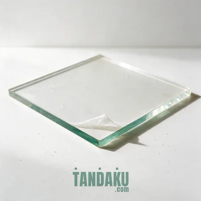
| 10mm Transparent Acrylic | A substantial clear edge with a solid, glass-like appearance |
These are different material choices, rather than thickness upgrades available in every finish. Check the exact option on the product page instead of assuming that every colour comes in the same thicknesses.
When is a simpler or cheaper option enough?
For an office wall that already has suitable room lighting, unlit acrylic letters may provide all the definition you need. A clear silhouette and a suitable stock colour can do more for readability than an elaborate reflective finish.
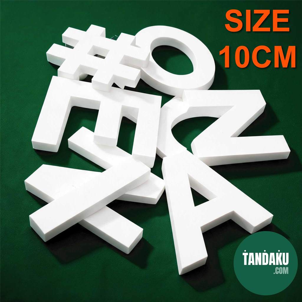
If your priority is chunky depth on a tight budget, consider PVC foam letters. Tandaku offers them as a budget-friendly way to put a business name on a wall. Compare the live configurations using your complete design size before deciding which gives the appearance you want for the money.
If raised lettering itself is optional, a printed panel may be enough. It can carry the business name and supporting information together without arranging separate letters. The acrylic, ACP and KT board comparison explains how those panel choices differ.
Spend on the feature people will notice in your setting. For a reception sign seen from the doorway, readable colour and layout should come before a thicker edge that visitors may barely see.
How do you check the price and prepare your order?
Enter the overall width and height of the complete design on the acrylic letters page. Use the full arrangement, including the spacing between letters, rather than entering the height of an individual character as the design size.
As one live example, a 600 × 300 mm design in 3mm Tinted Orange Acrylic is RM61.20 for one piece before delivery and paid options. That example applies to the stated size and material; use the product page for your own configuration.
Before ordering, settle the wording, letter colour, finish and overall dimensions. Check that the design preview represents the actual background, and distinguish the main business name from any smaller supporting text.
This ordering route is for supply-only lettering where you handle installation separately. Choose the material for the finished setting, then review the selected options and price before payment.
FAQ
What is 3D signage?
Dimensional signage has physical depth, such as letters cut from acrylic or formed into deeper boxes. Flat-cut acrylic letters have a visible material edge, while fabricated letters can create a much deeper shape.
How to make 3D signage?
For acrylic lettering, prepare the wording or logo and choose the overall design size, material and finish. Compare the design against the intended wall before ordering, especially if you are considering translucent or reflective acrylic. Enter the complete design dimensions on the product page to check the price.
How much is 3D signage?
The price depends on the letter type, overall design size, selected material and options. The acrylic letters page shows a live price after you enter your dimensions and choose the finish. Use that configuration when comparing choices, because a sample price for another material or size does not establish your order total.
What is 3D sign board?
A dimensional signboard uses raised elements such as separate letters or a raised logo. Those elements may sit on a backing panel or form a design directly on a wall. Decide whether you need the raised effect before choosing between lettering and a printed panel.