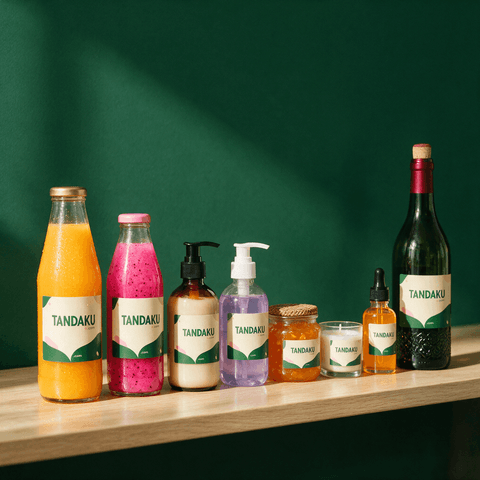
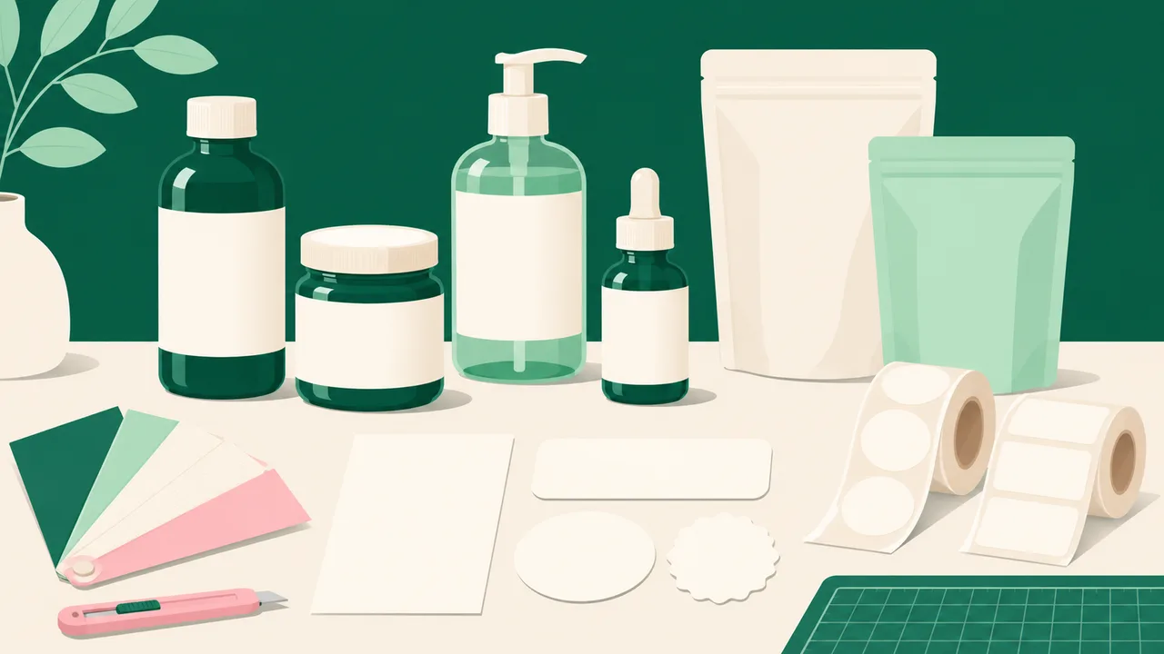
For a readable packaging label, choose its finished size on the actual container, then arrange the wording so the product name and essential details are easy to find. Check the artwork at that size, with the intended material and cut outline, before approving it for printing.
What needs to be readable on your label?
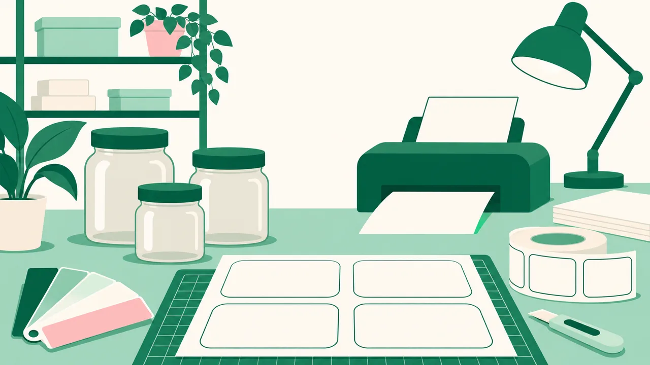
Start with the words someone needs when picking up the pack. Give the product name a clear position, then arrange the supporting information beneath or beside it. Decorative artwork should leave enough space for the wording people actually need to read.
Avoid giving every line the same size and weight. When the brand, product name, description and instructions all compete, the reader has to search for the useful part. Make the order clear through spacing and emphasis.
If the wording feels crowded, edit it before shrinking it. Remove repeated phrases, shorten a description where possible and separate information into clear groups. Do not remove required product information simply to make the design look cleaner.
Use the final wording while designing. Placeholder text can hide a space problem that only becomes obvious when the real ingredients, instructions or product description are added.
How do you check label size on the actual packaging?
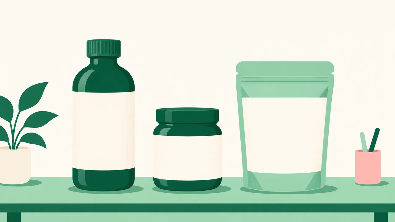
Measure the usable label area on the bottle, jar or pack. Pay attention to the flat or straight-sided area rather than assuming the whole container is available. A shoulder, seam or fold can interrupt the design.
Cut a paper mock-up to your intended label size and place it on the actual packaging. This helps you judge the fit before ordering printed stickers. If the artwork wraps around a bottle, check which words remain visible when you look at it from the front.
Print the artwork at its intended finished size for a reading check. A design that looks spacious when enlarged on a screen may feel crowded on a small jar. Keep the paper mock-up as a size and layout check; its colour and finish will differ from the selected sticker material.
If it is difficult to read, try a larger usable area, shorter wording or a simpler layout. Enlarging the logo alone will not solve crowded supporting text.
Which label material keeps your text easy to see?
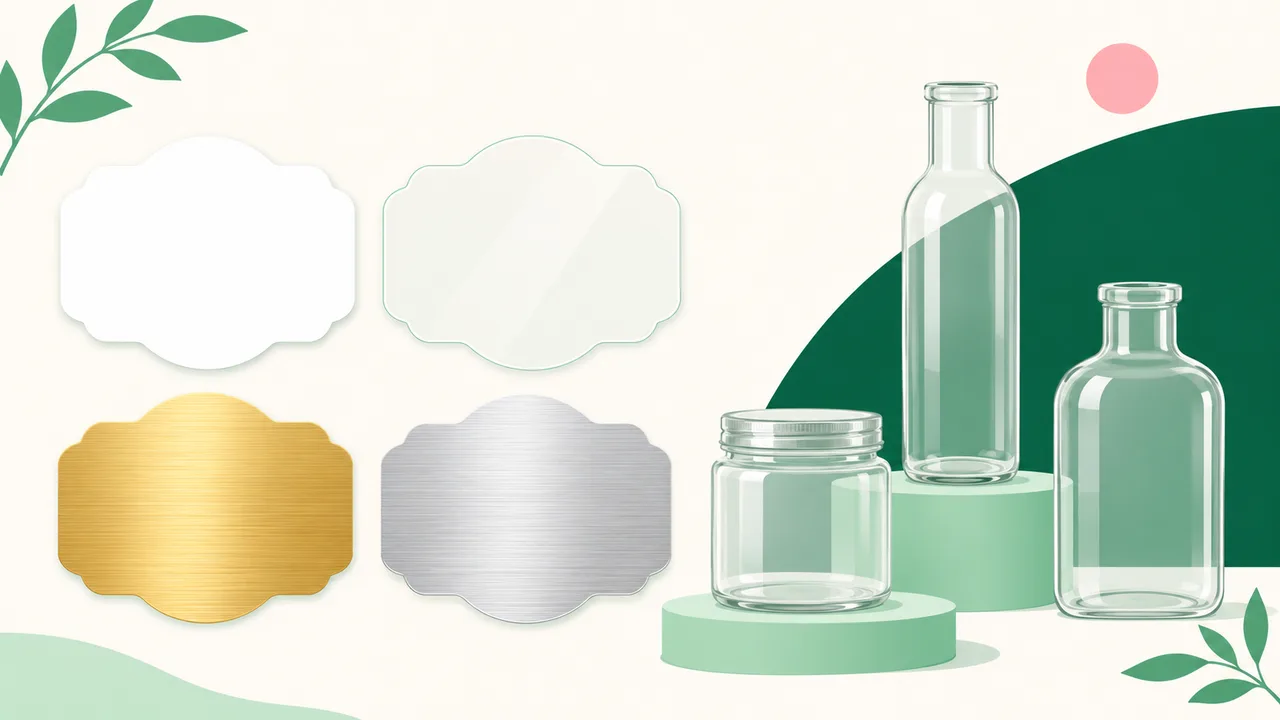
Choose the background together with the artwork. Tandaku's label choices include white, ultra clear, frosted, gold metallic and silver metallic materials. Their different backgrounds matter when you are deciding how the wording should look.
| Label material | Published rate per square metre | When to consider it |
|---|---|---|
| White Waterproof Sticker | RM43.06 | A white background for the label design |
| Ultra Clear Sticker | RM48.40 | A transparent label where the container remains part of the appearance |
| Gold Metallic Label | RM48.40 | A brushed gold background |
| Silver Metallic Label | RM48.40 | A brushed silver background |
These are material rates, not prices for an individual small label. Enter the finished dimensions, quantity and selected options on the label sticker page to see the configured price before delivery.
White is the cheaper option here and is enough when you want a white background behind your design. Choose clear or metallic material because its appearance serves the packaging, rather than assuming a higher-priced material will make small wording clearer.
For transparent designs, read the clear sticker guide before settling on the artwork.
How do you show the cut outline you want?
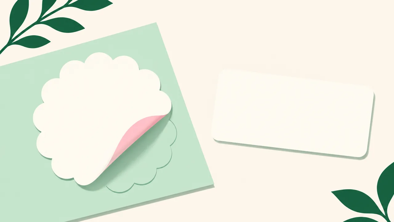
Make the intended sticker boundary clear. A rectangular image file does not, by itself, explain whether you want a rectangle, a circle or an outline following the illustration. Show the finished shape separately from the decorative artwork.
Kiss cut describes a cut through the sticker layer while leaving its backing intact. The outline describes the sticker's shape. If you want a shaped label that stays on a backing sheet until peeled, explain both requirements.
Keep wording and important details comfortably inside the intended boundary. Avoid placing a fine border directly against it: any visible difference between the print and cut position becomes easier to notice there.
If your artwork includes a line showing the proposed cut, identify it clearly as a guide. Ask how to supply it so that it is understood as a cutting instruction rather than a line you want printed. Check the outline before approving the artwork.
What should you check in the final artwork?
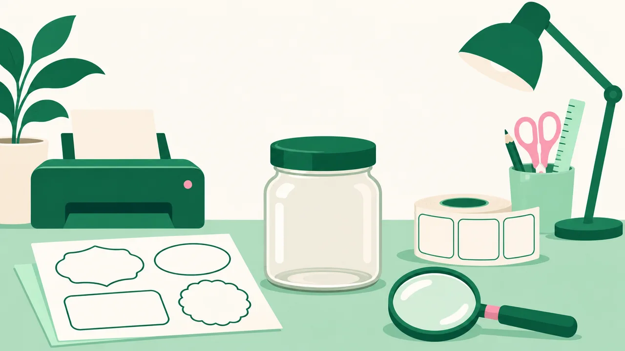
Review the file at the ordered dimensions. Check spelling, product variants, punctuation and the smallest wording. Look carefully at pale text, thin lettering and decorative fonts, especially where the background is busy.
Keep the original design file and export from that file. A screenshot may be useful as a visual reference, but it can hide whether the artwork contains enough detail for the intended print size. Enlarging a screenshot does not restore missing detail.
Check the background behind every text block. Dark wording against a pale background is easier to assess than wording over a detailed photograph. Where a photograph matters, give the supporting information a quieter area of its own.
Colour also needs a separate check. Use the printing colour guide to understand colour preparation before approving a shade based only on your screen.
Finally, review the exact file version you intend to print. If you change the wording or dimensions, repeat the reading and fit checks on that version.
How do you order without losing the design details?
Bring the measurements, material choice, quantity and artwork together before placing the order. State whether the label is for the front of a container or is intended to wrap around it. Explain the finished shape and how you want the labels supplied.
For different product variants, clearly match each file to its wording and quantity. Similar-looking filenames make it harder to spot an accidental mix-up during your own checks.
Compare the order dimensions against the artwork and your paper mock-up before approving. If your company needs purchasing approval, a quotation or proforma invoice PDF is available through checkout.
The product label printing guide covers the broader material, size and quantity choices. Use this artwork check alongside it, then price the configuration that matches your packaging.
FAQ
How to make label stickers?
Measure the usable area on your packaging, prepare the design at its intended finished size and check a paper mock-up on the container. Keep essential wording readable and make the intended cut outline clear before sending the artwork for printing.
What size is a label sticker?
The right size depends on the usable area of the packaging and the information the label must carry. Choose the dimensions using the actual bottle, jar or pack, then check that the wording remains readable at that size.
How to order label stickers?
Open the label sticker product page and enter your dimensions, material, quantity and available options to see the price. Match those selections to the final artwork, and explain any shaped outline or backing requirement before approving the print.
How to print label stickers?
Prepare the original artwork at the intended label dimensions and check it at that size before submitting it. Send clear instructions for the material and finished shape, and review the wording and outline together before approval.