

Measure an acrylic letter sign by the complete layout: the outside width and height of all the wording, including spaces between letters and lines. Check that layout on the actual wall before ordering, because individual letters can look suitable while the finished wording is too wide or crowded. Keep the letter height, overall layout size and material thickness clearly labelled so they cannot be confused.
What should you measure on the wall first?
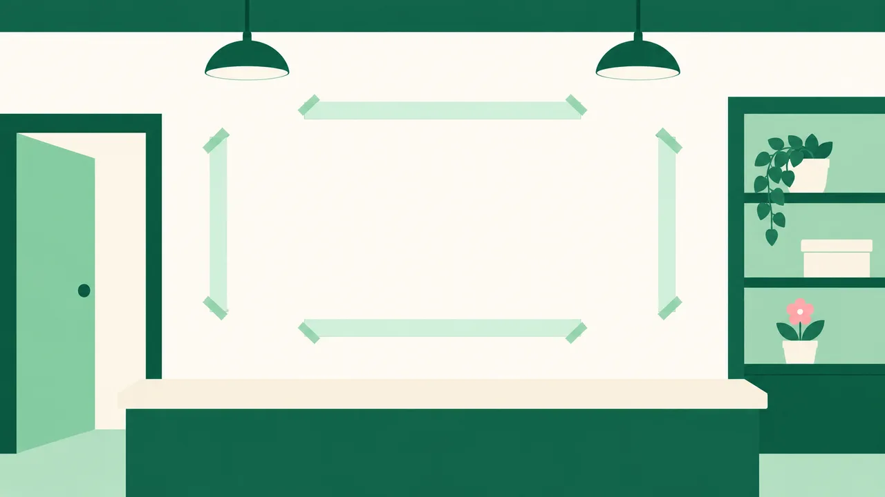
Measure the clear space where the sign will sit. Use the usable wall area rather than the full wall width if there are switches, shelves, door frames or other objects nearby. Leave room around the wording so it does not appear squeezed between them.
Take a straight-on photograph and record the available width and height separately. A photograph helps explain the setting, but it cannot replace measurements: perspective can make a wall look wider or taller than it is.
Also look at what sits below the sign. A reception counter, cabinet or doorway can change where the wording feels centred. Decide whether the layout should align with the wall itself or with the feature beneath it before preparing the final artwork.
For broader advice on choosing the available sign area, see the guide to shop signboard sizes.
Is letter height the same as the overall sign size?
Letter height describes an individual letter. Overall layout size describes the outside boundary of the complete arrangement. They are different measurements, especially when the design contains several words or lines.
| Measurement | What it describes | What to check |
|---|---|---|
| Available wall area | The clear space where the sign can fit | Nearby objects and the intended position |
| Overall layout width | The span from the leftmost shape to the rightmost shape | All wording and the spaces within it |
| Overall layout height | The span from the highest shape to the lowest shape | All lines, punctuation and descending letter shapes |
| Letter height | The height of a particular letter | Which letter or part of the artwork was measured |
| Material thickness | The depth of the acrylic from front to back | The selected material specification |
When sending dimensions, say what they refer to. A measurement described only as “height” can mean the tallest letter, the complete layout or the space available on the wall. Label these separately on your drawing.
Acrylic letters are usually 3mm thick, with other thicknesses available when wanted. That thickness does not tell you how tall the wording will be or how much wall space it needs.
How do you check whether the wording will fit?

Prepare the complete wording in its intended font before deciding its finished width. Include punctuation, spaces and any smaller wording that belongs beneath the main name. A short word in a wide font can occupy more wall space than expected.
Keep the proportions of the lettering when resizing. Squeezing a layout sideways to make it fit changes the letter shapes and can make the result look awkward. If the wording is too wide, reconsider the font, the wording or the line arrangement.
For a long name, compare a continuous line with a stacked arrangement. Check both against the available height as well as the width. Stacking the wording may solve the width problem while creating a layout that is too tall.
Do this with the final wording. A placeholder name or an approximate font can give a misleading impression of the space required. The sign letter types and fonts guide explains the wider choices before you settle the layout.
How much space should you leave between letters and lines?
Use spacing that makes the wording easy to read as a whole. Letters should feel connected as words, while the spaces between words should make their boundaries clear. There is no useful universal gap to apply without seeing the actual font and arrangement.
Look for pairs of letters that appear unusually crowded or separated. Equal measured gaps do not always look equal because letter shapes leave different amounts of empty space around their edges. Review the complete wording rather than adjusting each gap in isolation.
For stacked wording, check that the lines remain distinct. Descending strokes and punctuation can bring adjacent lines closer together than the main letter shapes suggest.
Remember that the spaces are part of the finished layout. If you spread the letters farther apart after the size has been agreed, the overall width changes too. Keep the spacing shown in the final artwork consistent with the dimensions you order.
How can you test the layout before committing?
Use a paper mock-up at the proposed finished size. If making the complete lettering is impractical, mark the outside boundary with plain paper strips and place paper shapes where the main words will sit. This helps you judge the footprint, although the actual lettering is still needed to assess readability.
View it from the entrance, the approach to the counter and any other place where the sign needs to be understood. A layout that looks large while you stand beside the wall may feel small from the doorway. Check it from an angle too if people usually approach from the side.
Consider the wall colour and nearby lighting while reviewing the mock-up. Strong separation between the lettering and the background helps the wording remain visible. For the surface appearance, compare the choices in the acrylic letter finish guide.
If your aim is simply to display information, a printed board may be enough. Compare its configured price with raised letters before choosing; use raised acrylic when the separate letter shapes and their depth are part of the appearance you want.
What should you check before ordering acrylic letters?
Open the acrylic letters page with your finished layout measurements and chosen material ready. The page shows the exact price as you enter your size and select the options.
Check that the dimensions describe the artwork you intend to receive. Keep the wall measurements as supporting information rather than using them interchangeably with the finished wording size. If a dimension field is unclear for your layout, clarify it before submitting the order.
Review spelling, letter case, line breaks and spacing together. A change to the wording can alter the overall width, even when the letter height stays unchanged. Keep the final artwork and the agreed dimensions together so the intended arrangement is clear.
Tandaku handles online printing and signage supply only. Order here when you are explicitly choosing supply only and handling installation separately; settle the installation arrangement before placing that order.
FAQ
What is 3D signage?
3D signage has physical depth, such as raised acrylic letters that stand out from the surface behind them. For ordering, distinguish the complete layout size from the thickness of the material.
How to make 3D sign board?
Start with the final wording, measure the available space and prepare the complete layout in the intended font. Check its proportions and spacing on the wall before choosing the material and ordering the letters. Arrange installation separately when placing a supply-only order with Tandaku.
How much is 3D signage?
For Acrylic Letters in White Matte Acrylic · 5mm, a 600 × 300 mm (60 × 30 cm) piece is RM76.80 before delivery and paid options. This is the price of one piece in that configuration; enter your own size and material on the product page for the exact price of your order.